


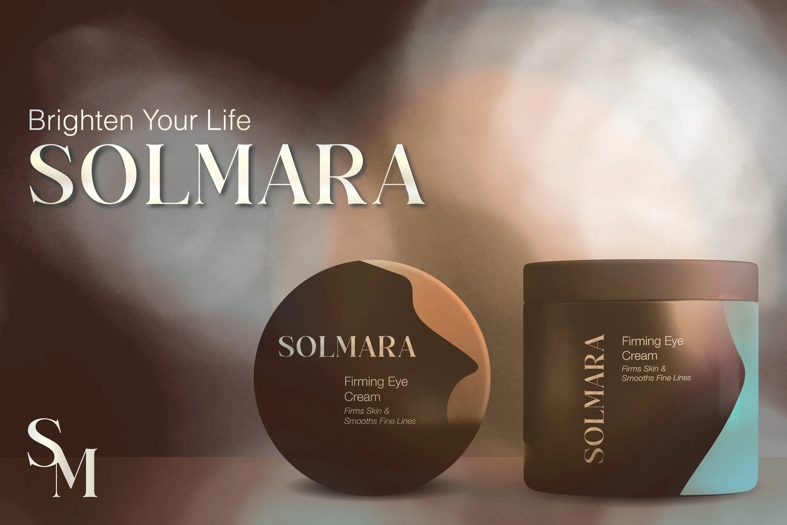
Solmara
Skincare Branding
Solmara
Luxury Skincare, Subtly Reimagined
Overview:
Solmara is a luxury skincare branding series that marries minimalist design with the warmth and elegance of coastal living. Inspired by abstract art and the serenity of a sunlit beach, the project represents a shift from my personal design preferences toward a refined, client-centered aesthetic. This brand identity focuses on delivering subtle sophistication, placing luxury directly into the hands of the consumer.
Tagline:
Brighten Your Life
Concept:
The name Solmara—a fusion of sol (sun) and mar (sea)—sets the tone for a brand that radiates both calm and class. The visual direction is understated yet expressive, using soft gradients, layered abstract shapes, and a neutral black palette accented by warm, beach-inspired tones. The result is a look that is quietly elegant and visually immersive.
Design Development:
Originally conceived under the name Lumine, the brand evolved through a redesign that introduced more distinctive elements and thematic depth. This included:
A refined serif logotype designed for versatility in both long and short formats
A rich yet minimalist label system that uses exclusion effects and abstract forms
A color palette inspired by sunlight and sea, evoking coastal luxury without excess
Logos


Packaging Design:
The skincare labels are designed to feel like small works of art—layered, textural, and nuanced. Abstract compositions provide visual interest, while the typography remains intentionally clean and minimal. The overall goal: balance aesthetic appeal with informative clarity.
Packaging
Advertisements


Pure Vision Reality

Upsurge

SPARC

From the Roots
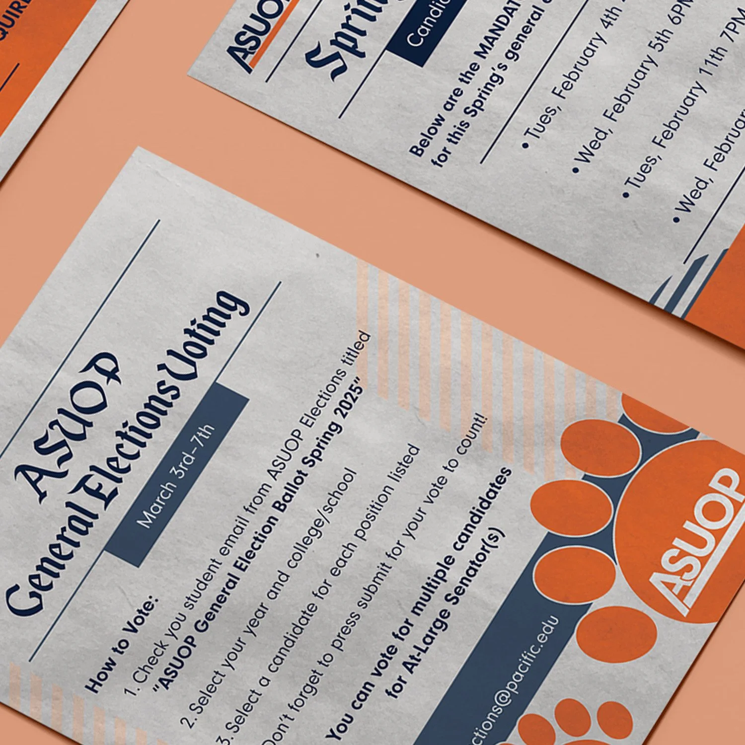
ASUOP

CASE