


Upsurge
Energy Drink Branding


Upsurge
Where Kombucha Meets Energy
Overview:
Upsurge is a kombucha energy drink brand developed for a Stockton-based entrepreneur looking to disrupt the wellness beverage market. By blending the natural health benefits of kombucha with the high-impact kick of caffeine, this brand targets a bold, health-conscious audience seeking both vitality and edge. Designed to stand out on the shelf and in the gym bag, Upsurge brings power, flavor, and attitude to every can.
Concept & Audience:
The brand identity was built to appeal to young adults (ages 18–28) with an active lifestyle and a growing interest in clean energy alternatives. While kombucha traditionally leans into wellness and subtlety, Upsurge flips that script—channeling the intensity and vibrance of traditional energy drinks while staying rooted in health-forward messaging.
Campaign & Advertising:
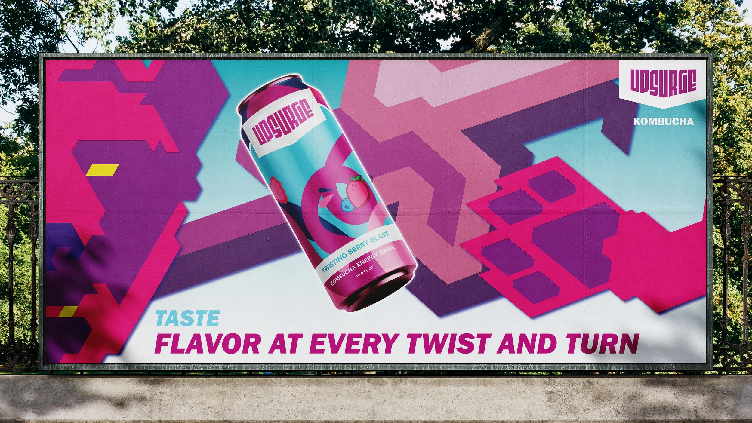
The advertising direction pairs each flavor with a powerful animal—symbolizing strength, energy, and nature. This connection amplifies the emotional resonance of the product and reinforces the idea of natural energy with impact. These visuals were used across print and digital ads to emphasize flavor identity, create buzz, and build brand memorability.


Sketches


Logo


Design Approach:
The branding strategy centered on high-energy visuals, striking color palettes, and dynamic linework to create a sporty, adventurous feel. The design was informed by a competitive analysis of kombucha and energy drink brands (like GT’s, Health-Ade, and Master Brew), and carefully balanced boldness with commercial appeal—ensuring it felt exciting but not overly juvenile.
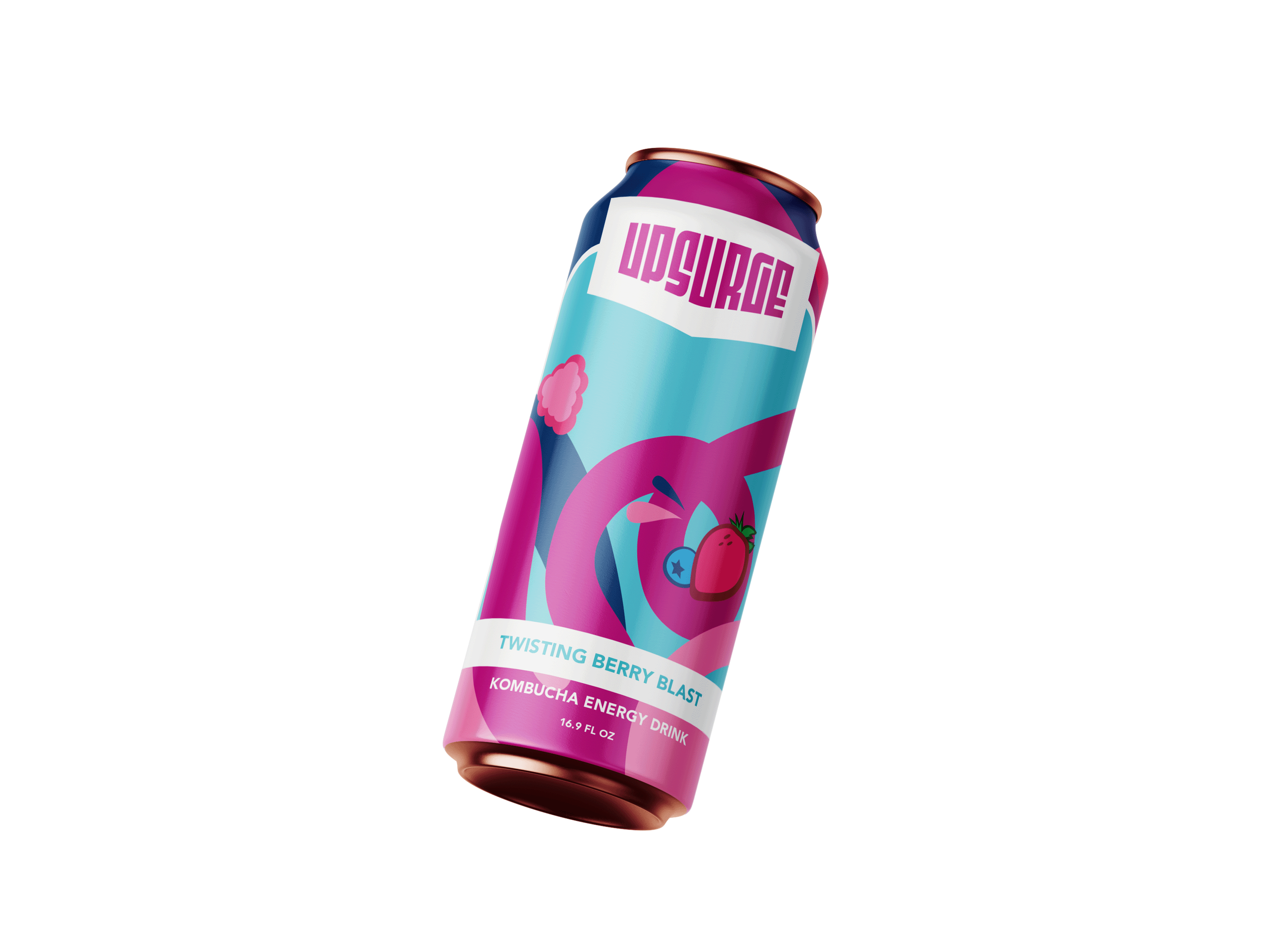
Label Design:
Each flavor features a unique visual rhythm:
Rushing Pineapple Mango – Wavy lines for a smooth but powerful vibe
Electric Lemon Cherry – Angular lines for sharp intensity
Twisting Berry Blast – Spiral lines to suggest energy in motion
These distinct line styles enhance flavor recognition while reinforcing the brand’s kinetic personality.
Labels


Advertisements


Pure Vision Reality

Solmara

SPARC

From the Roots
ASUOP

CASE